

User Experience Best Practices
Introduction
This guide is for product managers, designers, and marketers deploying Pinwheel through their apps/websites. It covers how to design the end-user experience — specifically, where to place and promote entry points to Pinwheel in your user journey, how to prime users before they enter the flow, and what language drives the best results.
Getting these right matters. We've found clients that surface Pinwheel at the right moment in the user journey see meaningfully higher completion rates than those that bury entry points in a settings menu. The guidance below reflects what we've learned across many deployments.
Deposit Switch
Where to place it in the journey
Three moments that work best:
- As part of account opening — frame it as part of finishing setting up the account, but keep it clearly optional and skippable. The motivation for users should be to complete the process; check all the boxes. (See the Zeigarnik effect.)
- Immediately after account activation — once the user is actually using the account (depositing to and/or spending from it), prompt them to make it their primary. The motivation for users should be to make easier to use the account (by automating deposits).
- Coupled with an engagement promotion — tie the switch to an incentive or campaign. Many clients utilize special account bonuses or premium feature unlocking.
Fallbacks: account settings, "add money" / deposit screens, or a persistent setup-checklist prompt. Keep it easy to find — if users have to go looking, most won't.
How to prime users before the flow
The Pinwheel Link UX includes a critical introduction screen, but for those who wish to design and present their own, the option to skip this screen exists.
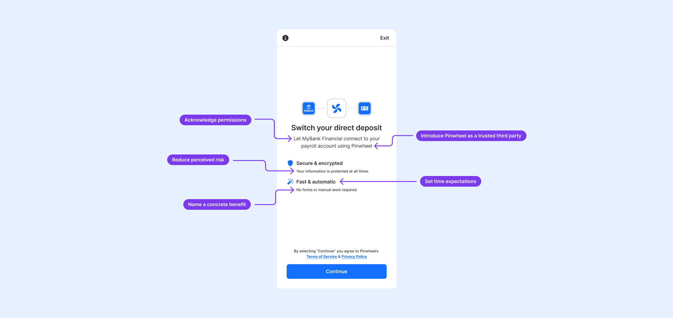
If you elect to skip the Pinwheel intro screen in lieu of presenting your own, follow this guidance:
-
Name a concrete benefit. Don't describe the feature — lead with what the user gets. "Get paid up to 2 days early" consistently outperforms "Switch your direct deposit." Tailor the benefit to your audience: early pay access resonates with paycheck-to-paycheck customers; simplicity and consolidation may resonate more with a premium checking audience.
-
Set time expectations. "Takes about 2 minutes" dramatically reduces abandonment. Users who don't know how long something will take assume it will take longer than it does.
-
Reduce perceived risk. Simple reassurances — words like "encrypted", "protected", "secured" — remove common hesitation points without requiring you to over-explain how direct deposit works.
-
Acknowledge permissions. Reinforce the fact that users stay in control and it's their data and information. Statements like "You can change this later" can work well here.
-
Introduce Pinwheel as a trusted third party.
You don't need a lot of words. A headline, two to three short lines of body copy, and a clear CTA is sufficient.
Call-to-action language
Recommended:
- "Switch My Direct Deposit"
- "Set Up Direct Deposit"
Avoid:
- "Get Started"
- "Learn More"
- "Set Up Now"
- "Continue"
Re-engaging users who didn't complete at account opening
Day 3 catches users while the account is still new and top of mind.
Day 14 catches users who may have just received a paycheck deposited to their old account — a natural reminder of what they haven't done yet.
Re-engagement framing:
- First outreach: benefit-led, same as initial priming. ("Don't forget — you can get paid up to 2 days early by switching your direct deposit.")
- Second outreach: add social proof or light urgency. ("Most [Bank Name] members have already made the switch.")
Keep re-engagement touchpoints to no more than two or three. After that, repeated prompts without response signal a conscious choice not to switch, and continued outreach risks feeling pushy.
Most common mistakes
These are the patterns we see most often in deployments that underperform:
- Burying Deposit Switch in account settings. If users have to navigate to find it, most won't.
- Launching Link without priming. Users who don't understand what they're entering drop off inside the flow. Do the framing work before Link opens.
- Using generic CTA copy. "Get Started" costs you conversions.
- Waiting to re-engage. Re-engagement is most effective at day 3 and day 14. Calendar-based "we haven't heard from you" emails are low-performing.
- Over-prompting. Two or three re-engagement touches is appropriate. Beyond that, repeated prompts signal to users that your institution is more interested in its own metrics than their experience.
Updated 2 months ago